Tilda – Mental health start up
Year
2020
Context and product
Tilda was a mental-health startup launched during the COVID-19 pandemic, at a time when emotional strain, isolation, and uncertainty affected many people. This specific offering was targeted at mature women.
The goal was to make professional mental-health support more accessible, less intimidating, and better integrated into everyday life.
Inspired by platforms such as BetterHelp, Tilda went beyond 1-to-1 therapy by focusing strongly on group formats, community-driven support, and structured therapeutic programs,
Problem space
During the pandemic, demand for mental-health services rose sharply—while access became more fragmented and overwhelming.
Key challenges included:
Lowering the barrier to seeking help, especially for first-time users
Designing for emotional vulnerability, trust, and safety
Translating therapeutic content into formats that work digitally
Supporting both patients and therapists within the same ecosystem
Adapting quickly in a fast-changing, high-stress context
Research and insights
Research was conducted before, during, and after launch, combining:
Qualitative interviews with women seeking mental-health support
Conversations with therapists and facilitators
Early usability testing of concepts and flows
Continuous feedback loops post-launch
Key insights:
Many users felt overwhelmed by “too many options” on existing platforms
Group therapy felt safer and more approachable when clearly explained upfront
Language mattered enormously—clinical wording increased anxiety
Trust was built through transparency, structure, and human tone
These insights directly shaped both UX decisions and content strategy.
Designing the user experience
1. Platform structure and navigation
I designed the overall structure of the website to:
Help users quickly understand what Tilda offers
Guide them gently toward the right format (group, program, or individual support)
Reduce cognitive load during emotionally sensitive moments
Clear framing replaced medical terminology, helping users feel oriented rather than diagnosed.
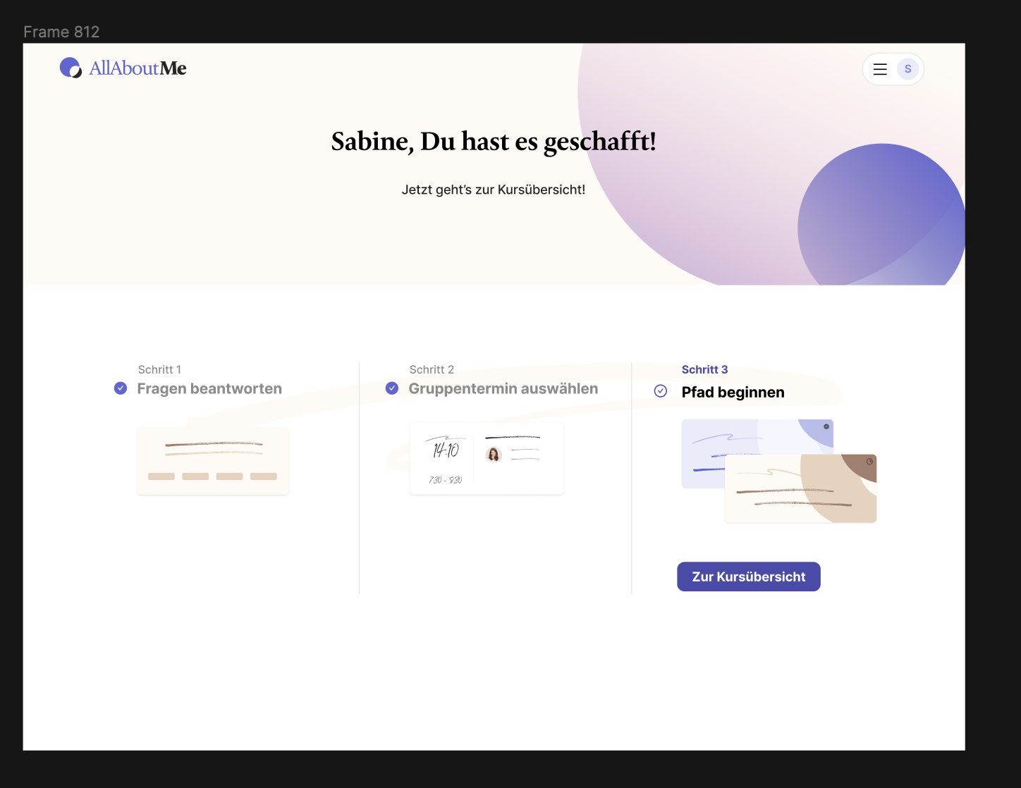
2. Booking and Group therapy flows
Group therapy was a core offering—and required careful UX design:
Transparent session descriptions (what happens, who it’s for, what to expect)
Simple booking flows that reduced friction and uncertainty
Clear preparation steps before sessions to build psychological safety
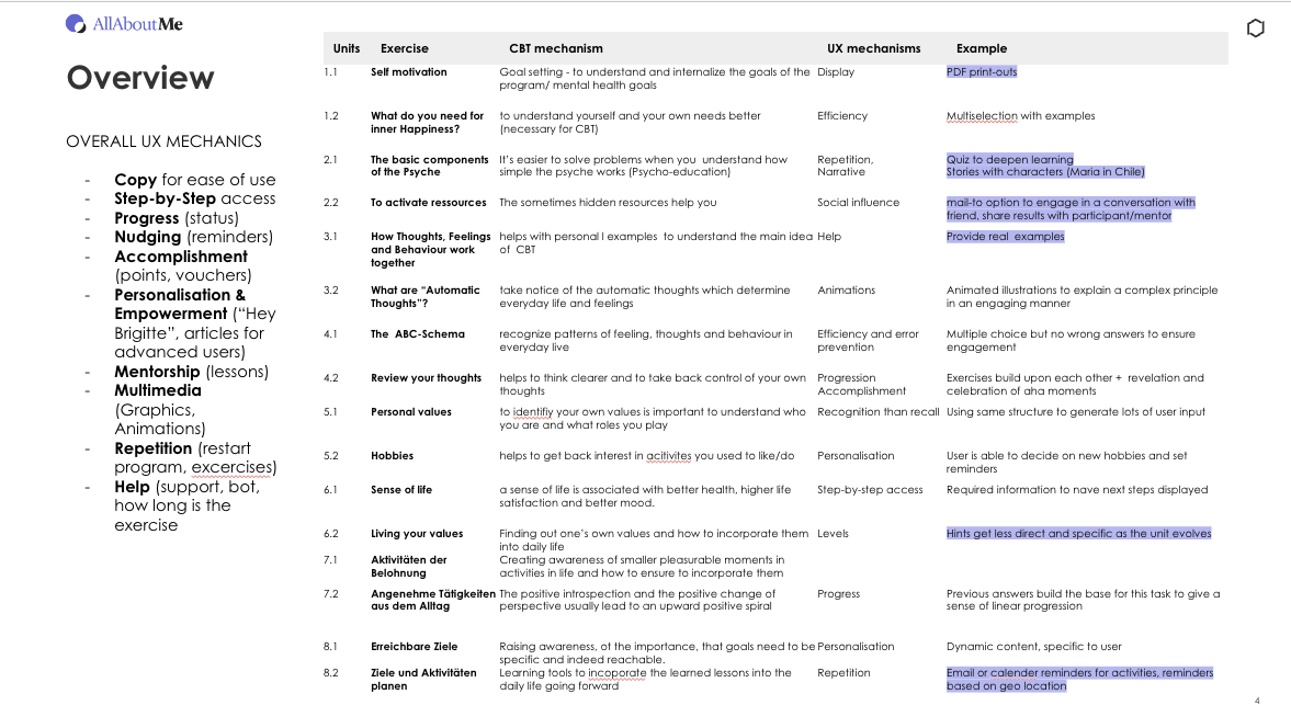
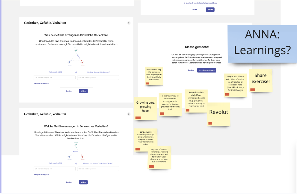
Translating therapy into digital formats
A central part of my work was translating therapist-provided units—often designed for in-person settings—into engaging digital experiences.
This involved:
Breaking down complex therapeutic concepts into clear, approachable steps
Structuring content for asynchronous and live use
UX writing that balanced warmth, clarity, and professionalism
Designing formats that supported reflection without overwhelming users
Outcome and impact
My role
I worked as UX Designer & Strategist, contributing across discovery, concept, and delivery. My responsibilities included:
UX research with users and potential customers
Information architecture and site structure
Booking flows for individual and group therapy sessions
UX for the therapist-facing backend
Translating therapeutic units into engaging digital experiences
UX writing and tone-of-voice alignment for sensitive content
Tilda demonstrated how human-centred UX can make mental-health support feel more approachable—especially in times of crisis.
Key takeaways:
Emotional safety is a design requirement, not a nice-to-have
Structure builds trust in vulnerable contexts
Language and interaction design are inseparable in mental-health products
Designing for therapists is just as critical as designing for users
The project strengthened my experience in sensitive domains, complex service ecosystems, and research-driven design—skills I continue to apply in data-heavy and high-stakes environments today.