Masterdata Editor
Note on confidentiality
Due to NDA restrictions, visuals shown here are anonymised, abstracted, or reconstructed examples. They illustrate my design approach and problem-solving process, not the actual production system.
Data as a service
Year
2024/25
Client
50Hertz
Role
UX/ UI Specialist
Context and challenge
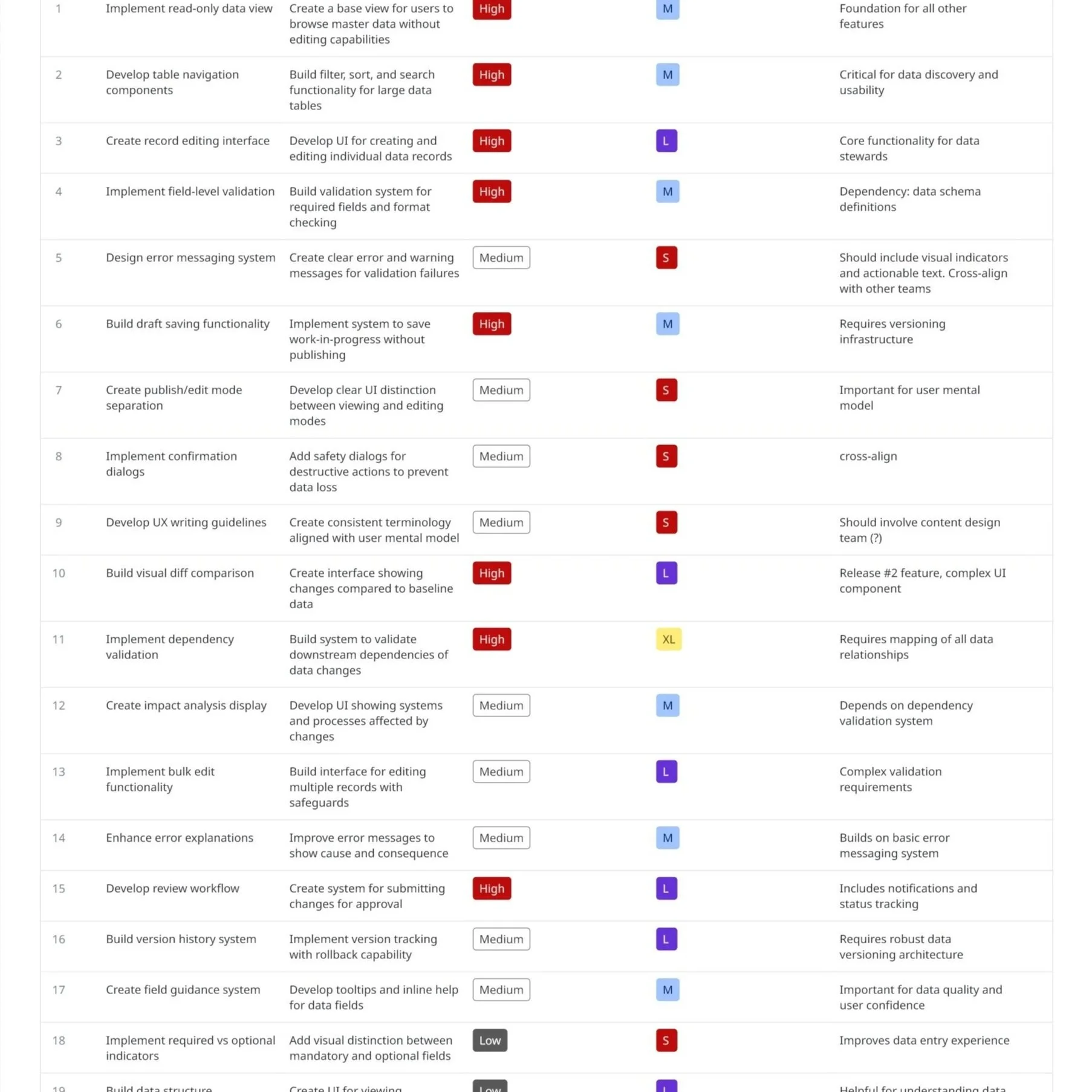
The Master Data Editor is a central tool for creating, editing, and validating master data that feeds multiple downstream systems. These systems rely on master data being complete, consistent, and correct—any error introduced at this stage can propagate across dashboards, analytics, operational tools, and automated processes.
While technically robust, the editor was originally shaped by system constraints and domain logic rather than user needs. End users—often domain experts but not software specialists—had to navigate complex rules, abstract terminology, and validation logic that didn’t align with how they think about their work.
The challenge was clear:
How might we translate complex technical and regulatory requirements into an interface that users can understand, trust, and work with confidently, without compromising data integrity?
Why the Master Data Editor matters
Master data is the single source of truth for a wide ecosystem of applications.
The editor directly impacts:
Data quality across all downstream systems
Operational reliability and decision-making
User efficiency and error rates
Trust in the system as a whole
Improving the editor meant improving every product and process that depends on it.
UX approach and process
1. Requirement gathering and stakeholder alignment
I started by working closely with product owners, developers, and system architects to understand:
Technical constraints and validation rules
Regulatory and domain-specific requirements
Dependencies between data fields and downstream systems
At the same time, I ensured that user needs were represented early, not treated as an afterthought. This created a shared understanding that UX and UI decisions had to respect both system logic and human logic.
2. End-user collaboration and research
To ground decisions in real workflows, I worked directly with end users through:
Contextual interviews and task walkthroughs
Observation of data edits, changes and workflows
Identification of pain points, workarounds, and mental shortcuts
This revealed a key insight:
Users were not “confused by complexity”; they were struggling with mismatched language, unclear feedback, and mental models that differed from the system’s structure and initially proposed navigation.
“I’m an electrical engineer, and I really wish I didn’t have to become an IT expert in order to do my job.”
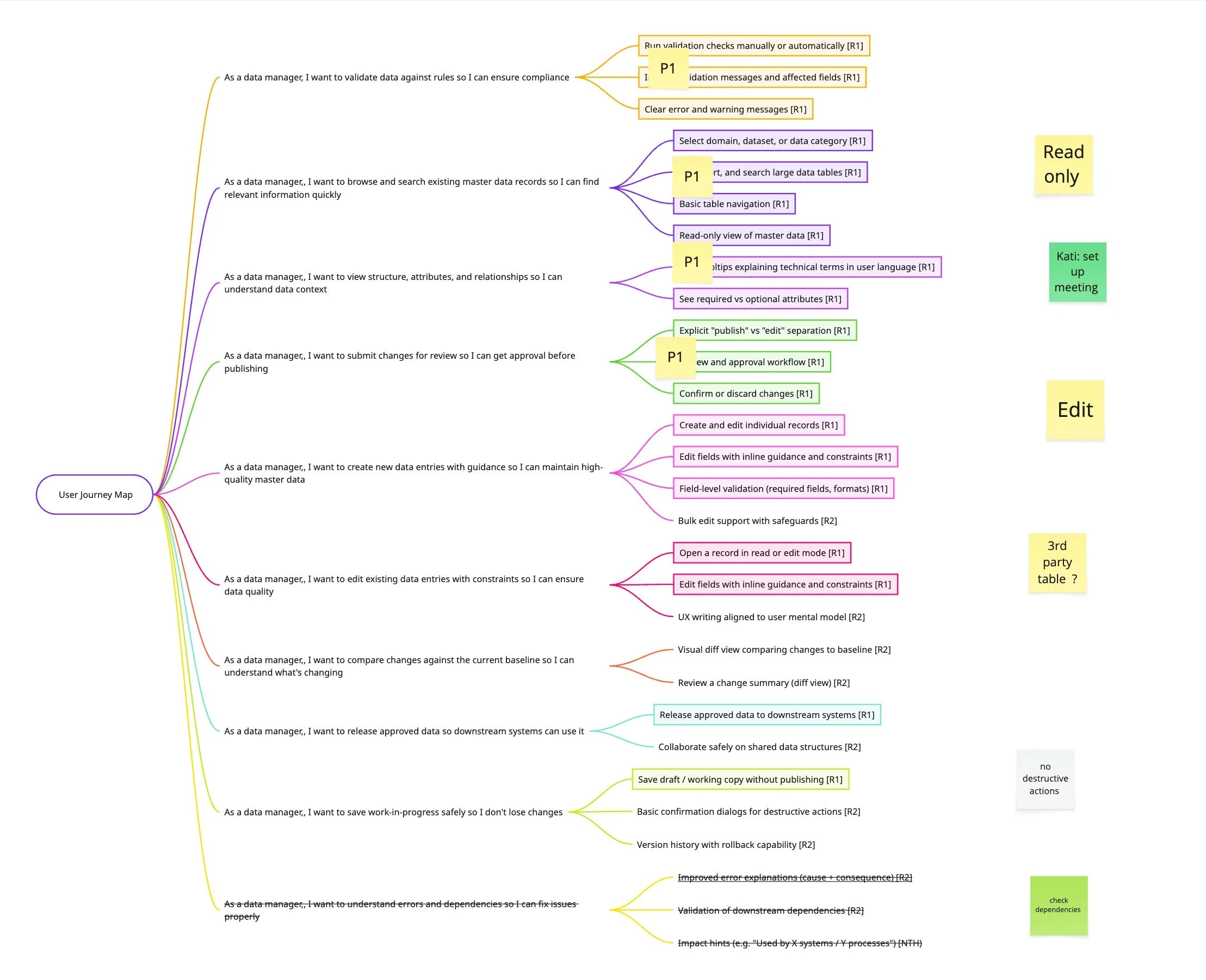
3. Translating technical logic into a human- and workflow- centred UI
One of the core challenges was bridging different “languages”:
System language: technical rules, dependencies, validation logic
User language: domain terms, real-world concepts, task-oriented thinking
My role was to translate between these worlds by:
Structuring complex forms into logical, user-driven steps
Making dependencies and validation rules visible and understandable
Designing clear states for drafts, errors, warnings, and confirmations
Reducing cognitive load through progressive disclosure
This ensured users could anticipate system behaviour rather than react to errors.
4. Research-driven prototyping and iteration
An early assumption in the concept was that users would look up and work on data related to a single asset or entity at a time. The navigation and filtering logic were therefore designed to support a fairly linear workflow: select an asset, open its data, make changes, and move on.
Usability testing of the initial concept revealed a very different working pattern.
Instead of focusing on one asset in isolation, users consistently worked with multiple assets in parallel, often keeping several browser windows or tabs open at the same time. This helped them compare related assets side by side, understand dependencies and hierarchies.
This insight highlighted a clear mismatch between the original navigation concept and the users’ mental model. Rather than “drilling down” into a single asset, users needed to orient themselves at a higher structural level, with an option to narrow their focus.
As a result, the navigation and filtering approach was reworked to:
enable browsing and filtering on a higher, more abstract level (e.g. asset groups, domains, or structural categories)
support fast switching and comparison between related entities
reduce reliance on workarounds such as multiple browser windows
The updated navigation better reflects how users reason about their data: relationally, not sequentially.
Outcome and impact
My role
Lead UX/UI Designer & Strategist
User research and synthesis
UX writing and terminology alignment
Prototyping and validation
Ongoing collaboration with users, developers, and product owners and stakeholder management
The redesigned Master Data Editor resulted in:
Improved clarity and confidence during data entry
Reduced user errors and validation friction
Better alignment between system rules and user expectations
Stronger trust in the editor as a reliable source of truth
Beyond the tool itself, the work established UX principles, guidelines and a pattern library as well as writing standards that influenced other applicationss across the ecosystem.